Choosing interior paint colors is one of the most exciting parts of a home refresh — and one of the most overwhelming. You stand in front of hundreds of swatches, pick something you love in the store, bring it home, and paint a wall. Then you step back and think: that is not what I expected.
It happens to almost everyone. And it’s almost never the paint’s fault.
Color selection is a skill, and like any skill there are principles behind it that make the difference between a color you love and a color that sits wrong in your space. After 15+ years painting homes across Dallas and the DFW Metroplex, I’ve walked through this process with hundreds of homeowners. Here’s what actually works.
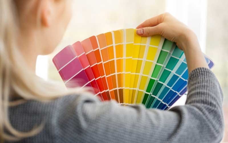
The Biggest Mistake: Choosing Color at the Paint Store
This one mistake is behind more paint regrets than any other — choosing your color under the fluorescent lighting at the paint store or hardware store.
Store lighting is harsh, glaring, and completely unlike what you have in your home. It changes the way you perceive undertones dramatically. A warm beige looks neutral in the store and turns distinctly pink on your south-facing living room wall. A sophisticated gray comes home and reads purple in your bedroom at night.
The rule: Never finalize a color choice at the store. Buy a sample, bring it home, and live with it on the actual wall — in the actual light of the actual room — for at least 24-48 hours before committing.
Start With What You Already Have
The second most common mistake is choosing paint color first — before anything else. Paint should be the last decision, not the first.
Your floors, furniture, countertops, tile, and rugs are fixed. You can’t change them for the cost of a gallon of paint. They dictate your color options more than anything else.
Before looking at a single swatch, take stock of your fixed elements:
- Flooring — warm wood tones, cool gray tile, travertine, carpet color
- Countertops — white marble, dark granite, cream quartz, butcher block
- Furniture — the dominant upholstery colors and wood finishes
- Trim and doors — white, cream, natural wood, painted
- Cabinetry — kitchen and bathroom cabinet color and finish
Your paint color needs to work with all of these, not fight them. If you have honey oak floors and warm wood furniture, a cool gray wall will feel disconnected and slightly off, no matter how beautiful it looked on the chip. Pull from the undertones already present in your space.
Understanding Undertones — The Key to Getting It Right
Every paint color has an undertone — a subtle secondary color underneath the dominant hue that becomes visible under different lighting conditions and next to different materials.
A white can have undertones that are pink, green, yellow, blue, or gray. A beige can pull peach, pink, or green. A gray can read purple, blue, or green depending on the light. This is why the same color looks completely different in two different rooms of the same house.
How to identify undertones:
Look at the darkest shade on the paint chip strip. The darkest swatch reveals the undertone most clearly, because the undertone becomes more concentrated as the color deepens. If the darkest shade on a “neutral beige” chip looks distinctly pink or purple, that undertone is present in every lighter shade on the strip — including the one you’re considering.
Warm vs. cool undertones:
- Warm undertones — yellow, orange, red, peach, pink, brown. These colors advance visually, making rooms feel cozier and smaller.
- Cool undertones — blue, green, gray, purple. These colors recede visually, making rooms feel larger and more expansive.
For cohesion throughout your home, choose colors that share the same temperature family — all warm or all cool undertones. Mixing warm and cool undertones across adjacent rooms creates a jarring disconnect, especially in open floor plans.
How Dallas Light Affects Your Color Choice
Light is the single most important factor in how paint color reads on a wall — and in Dallas, this matters more than most people realize.
Our intense Texas sun is directional and strong. A color that looks balanced in a room with soft northern light will look washed out and bleached on a south-facing wall at 2pm in July. A color that looks rich and deep in your shaded east-facing bedroom may look almost black in winter light.
Room orientation as a guide:
- South-facing rooms receive the most light throughout the day. Colors appear brighter and warmer. Almost any color works here; be careful with very warm or saturated colors that may feel overwhelming.
- North-facing rooms receive the least direct light and have consistently cool, slightly bluish light. Avoid colors with cool undertones — they’ll feel cold and flat. Choose warm neutrals with yellow, orange, or red undertones to compensate.
- East-facing rooms get warm morning light and cooler afternoon light. Great for energizing colors in breakfast rooms and home offices.
- West-facing rooms get cool morning light and warm golden afternoon light. Evening colors look their best here — rich terracottas, warm ambers, and deep greens.
Artificial lighting matters too. Incandescent and warm LED bulbs (2700K-3000K) amplify warm undertones. Cool daylight bulbs (5000K+) amplify cool undertones. If your room is primarily lit artificially in the evenings — a bedroom or dining room — test your swatches at night under your actual bulbs, not just in daylight.
Room-by-Room Color Guide
Living Room
The living room sets the tone for your entire home — especially in Dallas where open floor plans connect living, dining, and kitchen into one continuous space.
What works:
- Warm neutrals — greige, taupe, warm cream — photograph well, appeal broadly, and work with almost any furniture
- Earthy greens — sage, olive, eucalyptus — popular in 2026, feel sophisticated and grounded
- Warm whites with subtle undertones — creamier and more inviting than stark builder white
What to avoid:
- Very dark colors in small living rooms without natural light
- Cool blue-gray if your floors are warm-toned wood (the undertone clash is pronounced)
- Trendy saturated colors if resale value is a consideration
Recommended finish: Eggshell — soft sheen, easy to clean, hides minor wall imperfections.
Kitchen
Kitchens take a beating — grease, steam, splatter, and constant cleaning. Color choice here is as much about durability and practicality as aesthetics.
What works:
- Warm whites and creams — brighten the space, make it feel clean and fresh
- Soft sage or muted green — pairs beautifully with white cabinets and wood countertops
- Light warm neutrals — greige and soft taupe work well in kitchens with darker cabinetry
What to avoid:
- Very dark walls in a kitchen with limited natural light
- Flat or matte finish — it won’t survive cleaning
Recommended finish: Satin — durable, easy to wipe down, slightly more sheen than eggshell.
Primary Bedroom
The bedroom is where color psychology matters most. This is a room for rest, and the colors you choose directly affect how the space feels at the end of the day.
What works:
- Soft muted greens — sage, eucalyptus, dusty olive — calming and restorative
- Warm neutrals — taupe, linen, warm mushroom — cozy without feeling heavy
- Deep moody tones for drama — navy, forest green, warm charcoal — especially effective with white trim and warm lighting
- Soft warm whites — versatile, clean, works with any bedding palette
What to avoid:
- Saturated, energizing colors — red, bright orange, electric blue — they work against rest
- Cool stark white — feels clinical in a bedroom, especially at night
Recommended finish: Matte or flat — absorbs light softly, hides wall imperfections, creates a quiet, enveloping feel.
Bathrooms
Bathrooms are small, often have limited natural light, and deal with moisture and steam. They’re also where a bold color choice carries the least risk — a small room means less paint and less commitment.
What works:
- Warm whites and soft creams — keep the space feeling clean and bright
- Soft blue-greens and muted teals — create a spa-like, calming atmosphere
- Deep moody colors — navy, forest green, even near-black — surprisingly stunning in small bathrooms with good lighting
- Warm sage — one of the most popular bathroom colors in Dallas right now
What to avoid:
- Cool stark white — can feel harsh under bathroom lighting
- Flat finish — won’t survive moisture and frequent cleaning
Recommended finish: Satin — moisture-resistant, easy to clean, not too shiny.
Home Office
The home office color palette should support focus and productivity without creating fatigue. Color psychology plays a real role here.
What works:
- Deep earthy tones — warm charcoal, forest green, navy — promote concentration and reduce distraction
- Warm neutrals — greige, taupe, warm cream — flexible and easy to work in for long periods
- Muted sage or olive — calming without being sleepy
What to avoid:
- Very bright or saturated colors — stimulating in short doses, fatiguing over hours
- Very pale cool colors — can feel cold and uninspiring for focused work
Recommended finish: Eggshell or matte depending on your preference for sheen.
Open Floor Plans
Open floor plans present the biggest color challenge. You’re choosing colors for a continuous space that flows from room to room — and the wrong approach creates a disjointed, choppy feel.
The key principle: Choose colors that speak the same tonal language. You don’t need one single color throughout, but every color in an open-plan space should share warm or cool undertones. Mixing temperature families across connected spaces is the most common cause of an open floor plan feeling visually incoherent.
Practical approaches that work well:
- One main color throughout with a slightly deeper or lighter variation in a defined area (like the kitchen)
- Neutral main walls with a bolder color on one architectural feature — a fireplace wall, a kitchen island, a built-in
- Color zoning — using subtle shifts in tone to define functional areas without closing off the space
How to Test Paint Colors the Right Way
Once you’ve narrowed your choices to two or three options, here’s the process that actually works:
Step 1: Buy sample pots — not chips. A 2×2 inch chip gives you no useful information. A painted sample on your actual wall tells you everything.
Step 2: Paint large swatches — at least 12×12 inches, ideally larger. Small patches don’t give you an accurate read.
Step 3: Test on multiple walls — the north wall and the south wall of the same room will look completely different. Test on both.
Step 4: Observe at multiple times of day — morning light, afternoon light, evening under your artificial lights. Color changes significantly across a full day.
Step 5: Look at it next to your fixed elements — hold a paint chip next to your floor, your countertop, your sofa fabric. The undertone interaction is what you’re checking.
Step 6: Live with it for 48 hours before deciding. Your eye adjusts over time, and what looks wrong on day one sometimes looks right on day two — and vice versa.
Whole-Home Color Flow
If you’re painting multiple rooms or doing a whole-home refresh, color flow matters. The goal is for every room to feel like it belongs in the same house while still having its own character.
A few principles that make this easier:
- Choose a consistent trim color throughout the whole home. Crisp white, warm cream, or soft gray — pick one and use it everywhere. Consistent trim color is the single most effective way to unify a home’s interior.
- Vary depth, not temperature — lighter and deeper versions of the same color family flow naturally from room to room
- Limit your palette — three to four colors across a whole home feels cohesive; six or seven feels chaotic
- Think about transitions — what do you see when you stand in the hallway and look into multiple rooms at once? Those views should feel harmonious.
When to Call in a Professional for Color Advice
Most paint companies offer color consultation services — Benjamin Moore and Sherwin-Williams both have tools and in-store consultants. Many professional painting contractors, including East Dallas Painting, will walk through a color conversation with you as part of the estimating process.
If you’re doing a whole-home repaint, investing an hour in a color consultation before you commit to 15 gallons of paint is almost always worth it. The cost of repainting a room because the color was wrong is far more than the cost of getting it right the first time.
Ready to Start Your Interior Painting Project?
At East Dallas Painting, we’ve helped hundreds of Dallas homeowners navigate color selection, prep surfaces properly, and deliver a finish that looks exactly like they imagined — and lasts.
We offer free estimates and are happy to talk through color options during our walkthrough.
Call us today: 📞 214-612-6235 | 877-275-8751 📧 info@eastdallaspainting.com
Or book directly online — we’ll come to you and give you honest, experienced advice on color, finish, and approach for every room in your home.
East Dallas Painting serves Dallas, Plano, Richardson, Garland, Mesquite, Rockwall, and the greater DFW Metroplex.